Building a Scalable UX for Data-Driven Healthcare

Company

  • 1–10 Employees
  • HealthTech, SaaS
  • B2B

Project

  • 2 Months Timeline
  • UX Strategy & Planning, UX, UI Design

Services

  • Microsprint
  • UX Design Subscription

Lucerna Health is a healthcare data platform that lets care teams, health plans, and provider networks put all their data into one place. This empowers health teams and administrators to make smarter decisions and provide better healthcare experiences.

With a successful product that had been designed by their development team, Lucerna Health approached Meticular with two key needs:

  1. Guide them through a product strategy workshop for a new SLA dashboard—aligning their team around the features and functionality. Then design the UX UI of the dashboard with a fresh look and feel.
  2. Create a new look and feel for their platform as a scalable design system to streamline collaboration across their developers, product managers, and future designers.

Aligning Vision & Functionality With a Microsprint

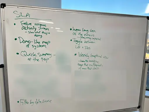
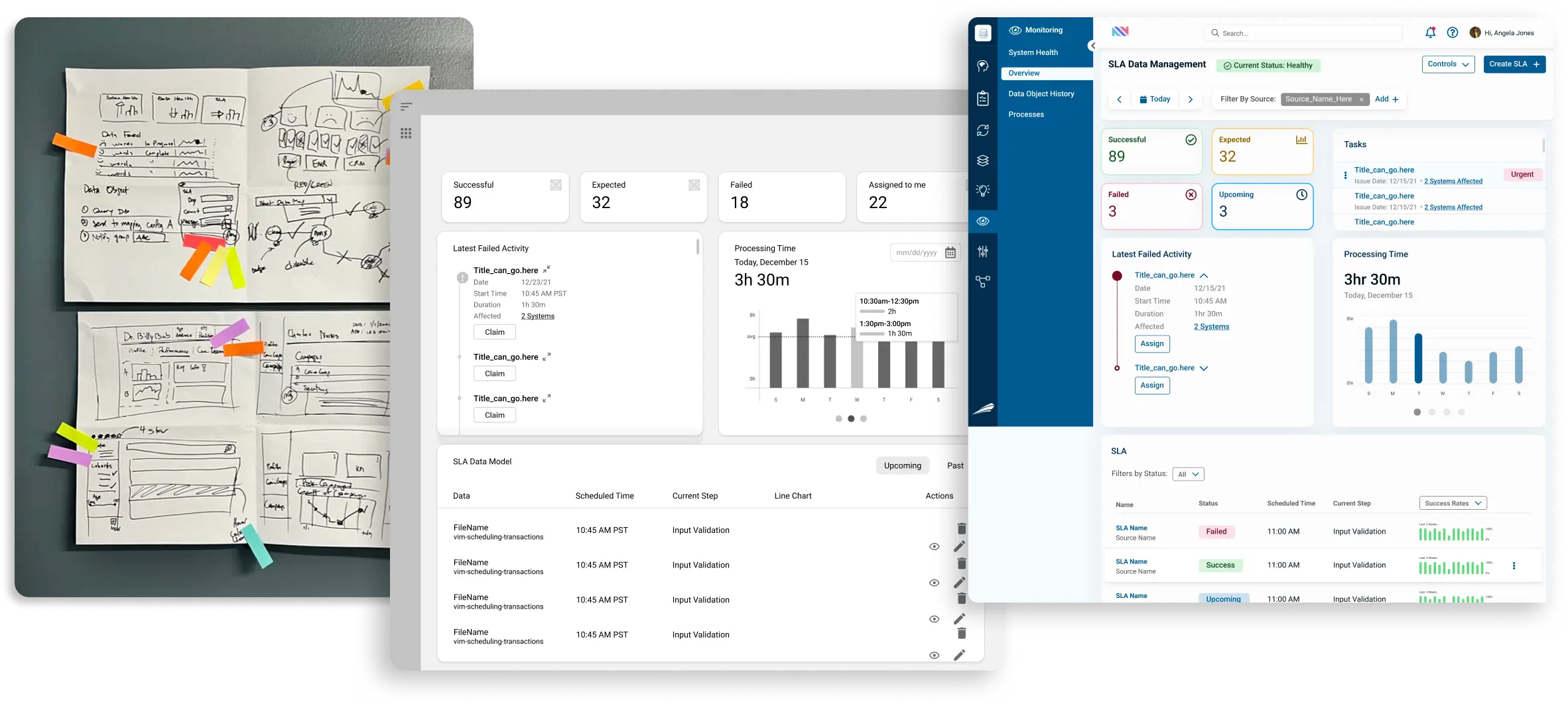
To kick things off, we went onsite to run a Microsprint workshop with Lucerna’s team. Together with their CTO and developers, we mapped out goals, challenges, and user stories for the new SLA dashboard.

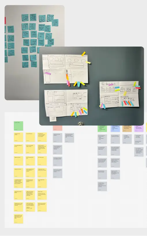
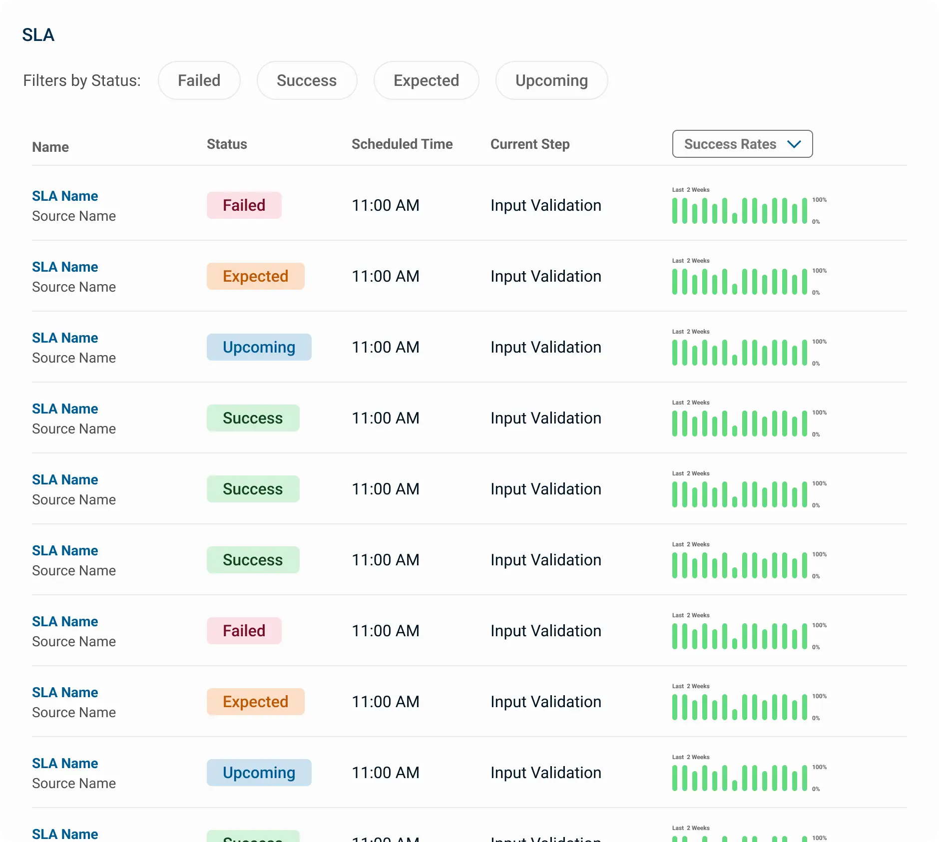
We were able to iterate through a ton of UI ideas during sketching exercises (a sample is shown in the photo above). By the end of the workshop, we had a blueprint for the dashboard that the developers and our team could build from.

Making The UX/UI Modern

With a solid strategy in place, we turned our attention to modernizing Lucerna’s platform. We started with navigation, restructuring the information architecture to account for multiple products and sub-views. A drawer system was introduced to help users quickly understand where they were within the product suite.

One of the biggest pain points was provider profiles—critical information was buried multiple clicks deep, making it difficult for users to access. We redesigned the UI using a tab-to-drawer pattern, allowing important data to surface when needed while keeping less relevant information tucked away. This enterprise UX challenge required a deep understanding of how and when users needed information, and our design ensured smoother, more intuitive access.

Scaling UX with a Design System

Before our engagement, Lucerna relied on ad-hoc wireframing in Lucidchart and design decisions made by developers referencing common UI patterns. Without a senior UX team in place, they lacked a consistent design system to unify their product’s look and feel.

We built a comprehensive Figma component library, allowing their team to quickly mock up new pages in a way that felt cohesive across the platform. A major focus was data tables, which required extensive functionality. The development team selected a library, and we designed a UI around it that seamlessly blended with the rest of the system—ensuring usability without sacrificing visual consistency.

Through this process, we didn’t just redesign the platform—we equipped Lucerna’s team with the tools and structure to scale their UX confidently into the future.