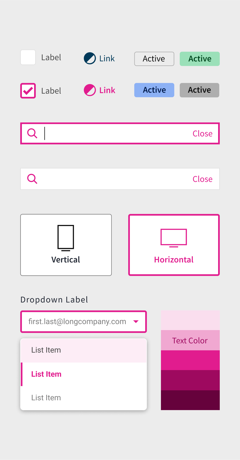
From interactive animations to custom icon creation guidelines to accessible color usage, we were able to create a design system and documentation that would allow designers to create a unified experience across the platform.
Upgrading the Tech of Enterprise Storytelling

Company
- 11–50 Employees
- Advertising & Marketing, Business Services
- B2B, SaaS / Service Hybrid
Project
- 2 Years Timeline
- UX Strategy & Planning, UX, UI Design, User Testing
Services
-
Microsprint
-
UX Design Subscription
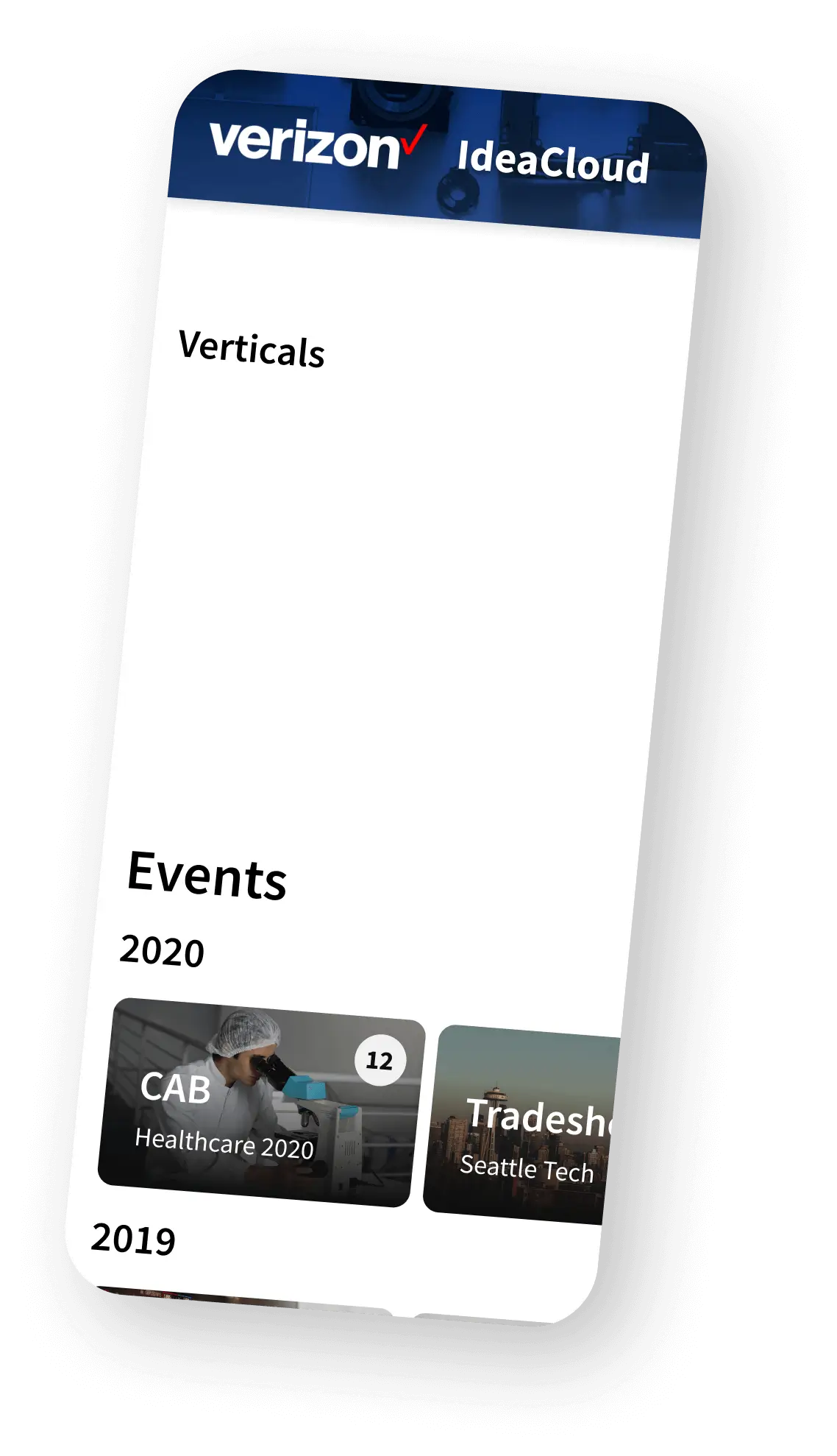
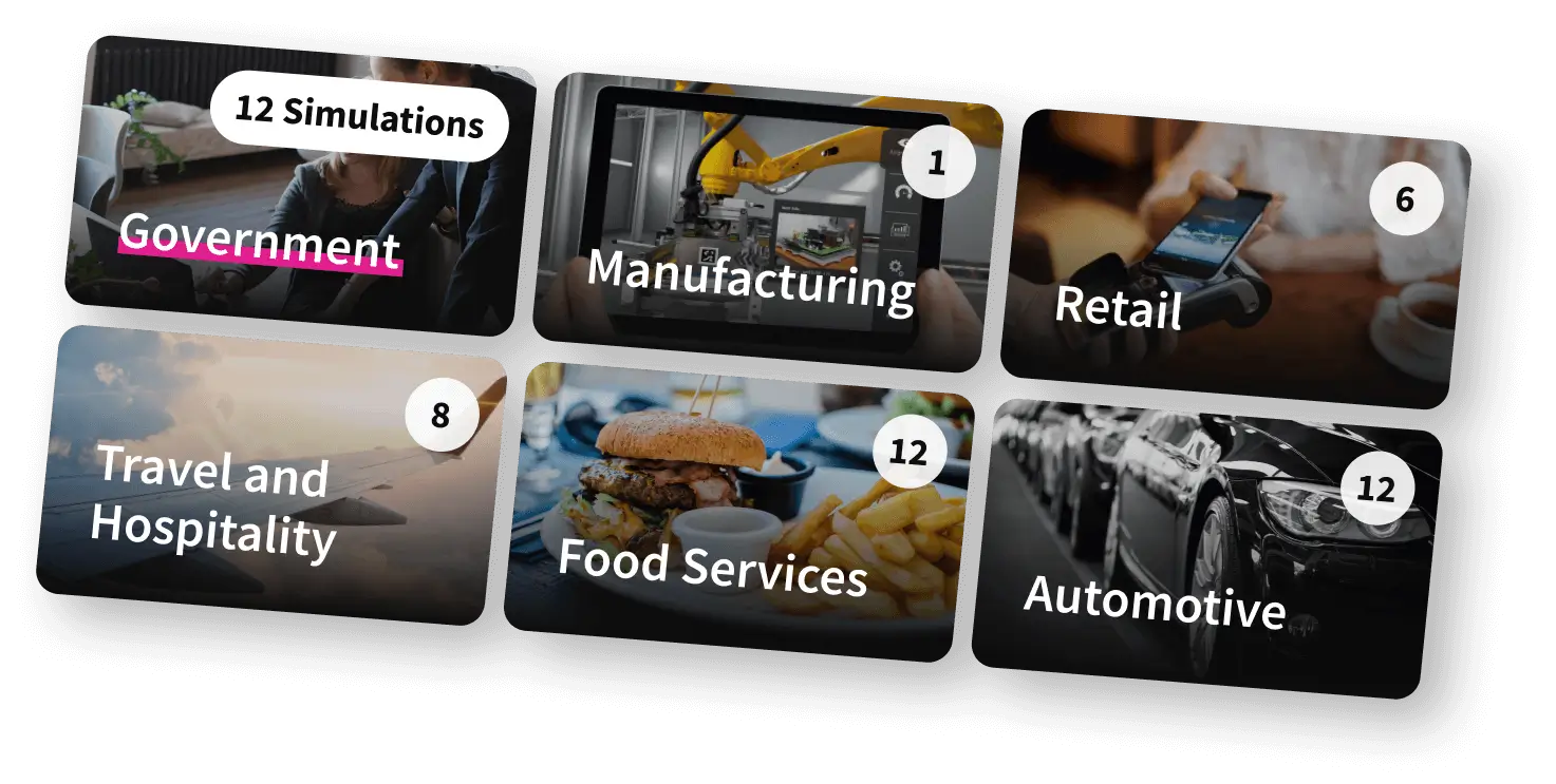
IdeaCloud (formerly ForgeDX) is an interactive storytelling platform that helps big tech companies, like Adobe, Verizon, and Microsoft, to tell the stories of their products through custom, immersive presentations called simulations.
They had grown their revenue exponentially with an MVP Design. While the software had continued to become more sophisticated, the design was handled mostly by single contractors and had not kept up.
They needed a UX partner that could help the launch a new product while also leveling-up the product design practice within their organization. Our plug-and-play UX department approach was a perfect fit and has lead to a partnership that lasted a 2 years.
Given the high level of design, industry expertise, and overall service, Meticular's cost was worth every penny. They were instrumental in our success.
Meticular will always be my first recommendation for anyone looking for high-level UX/UI design.

Unifying the Look & Feel Through a Design System

Redesigning the IdeaCloud Platform
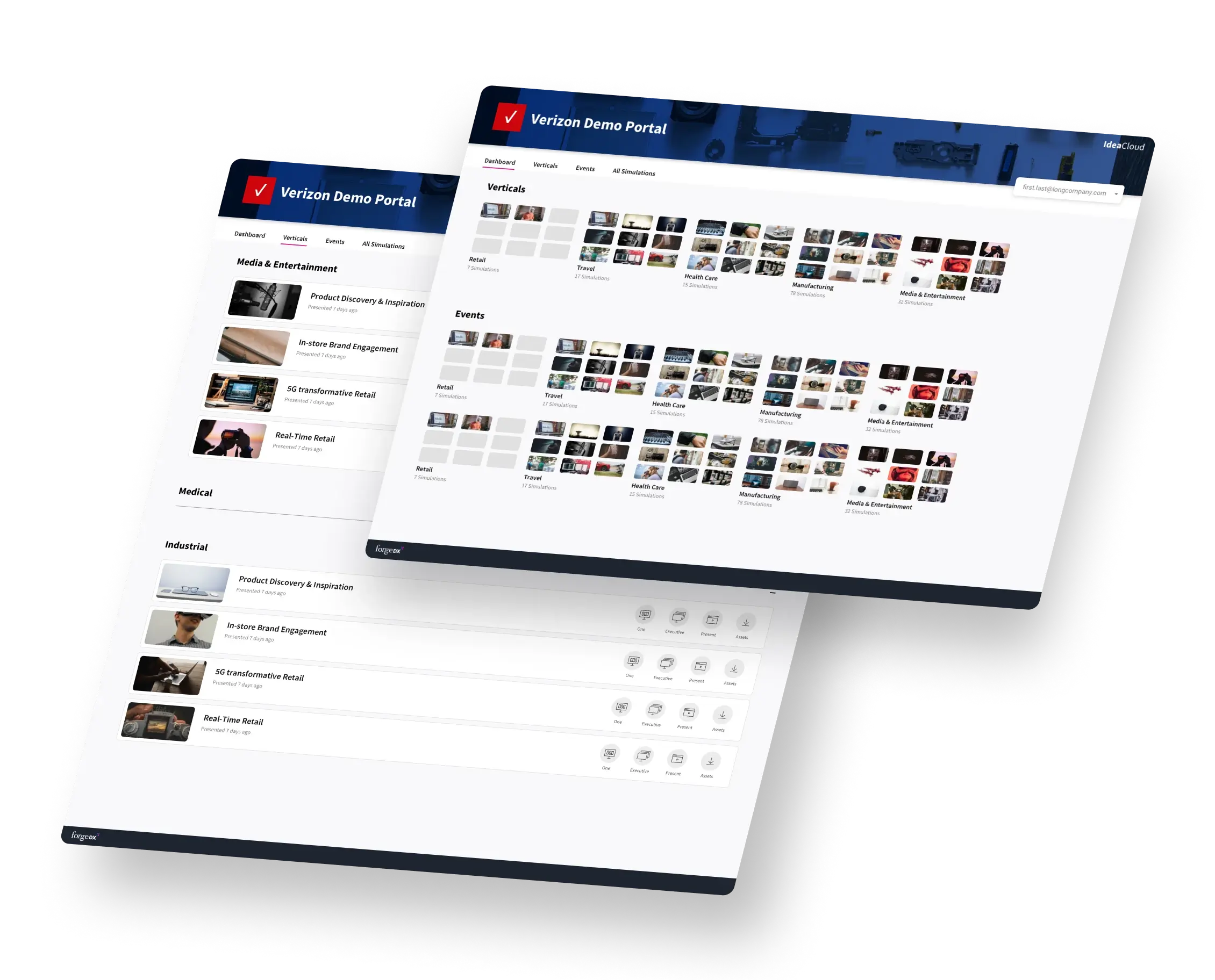
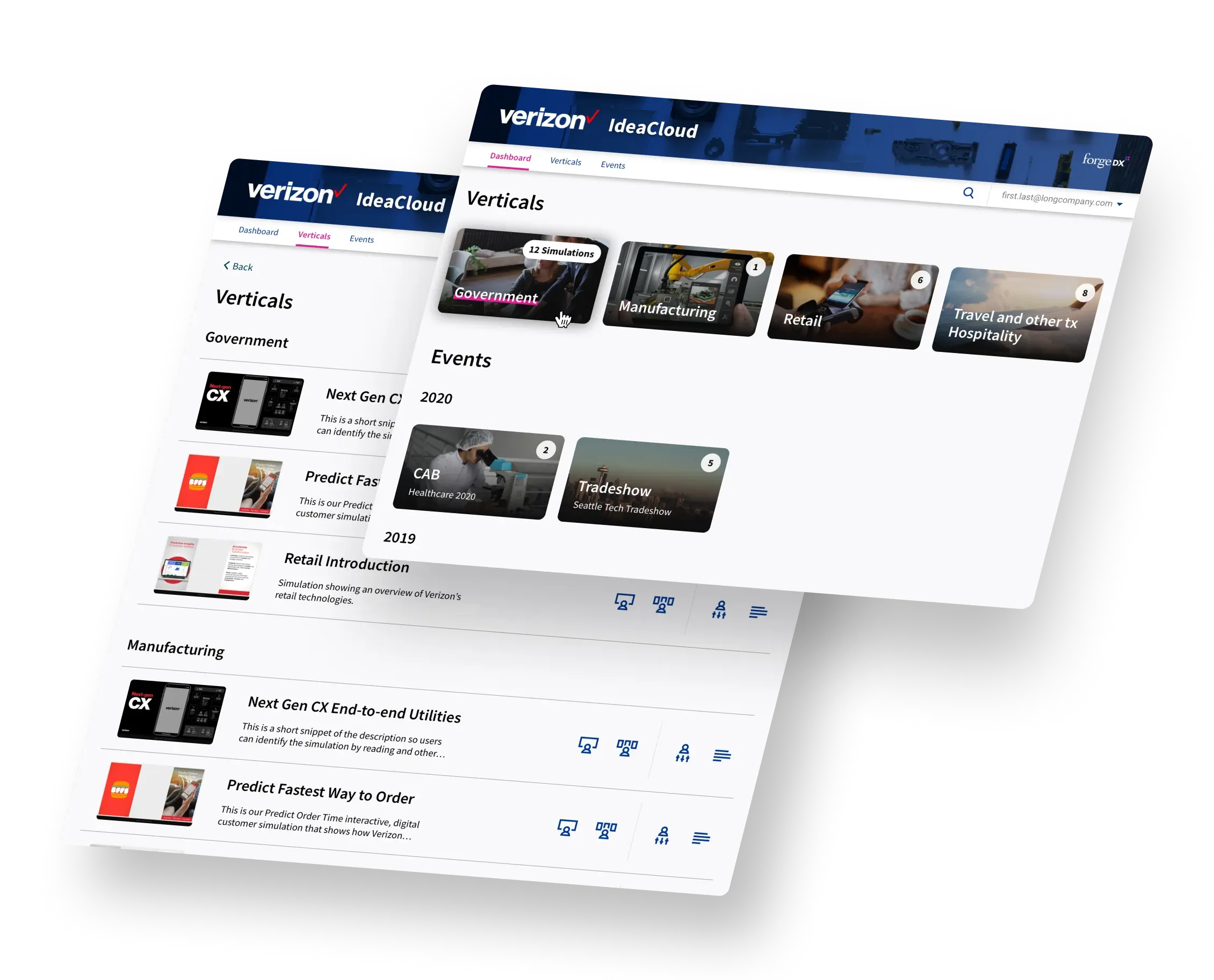
IdeaCloud shines at helping its customers tell incredible brand stories. We redesigned the MVP interface to include modern asthetics while getting out of the way of its users so they could find the simulation they wanted and get presenting.
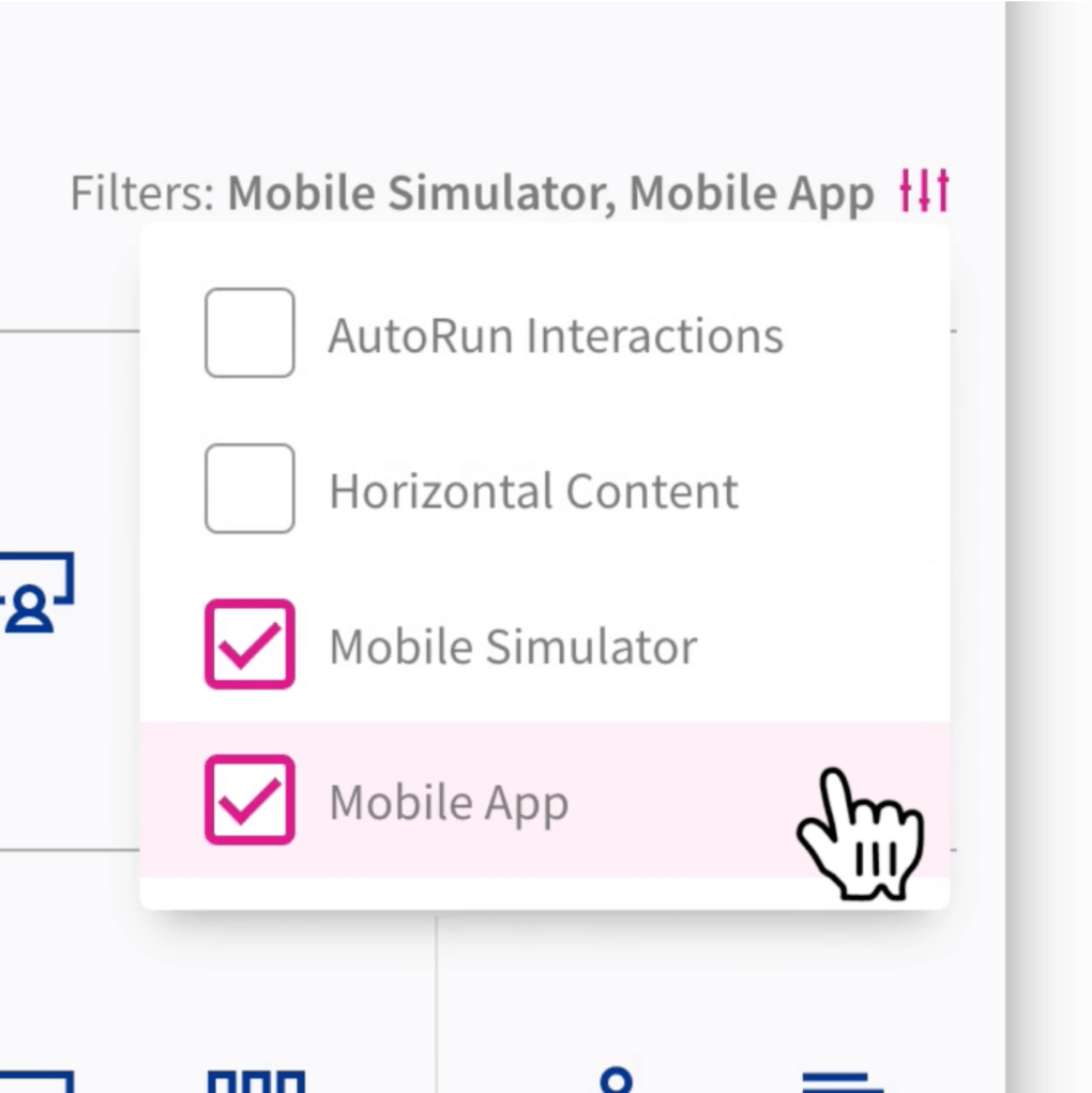
Launching the Next Big Revenue Stream
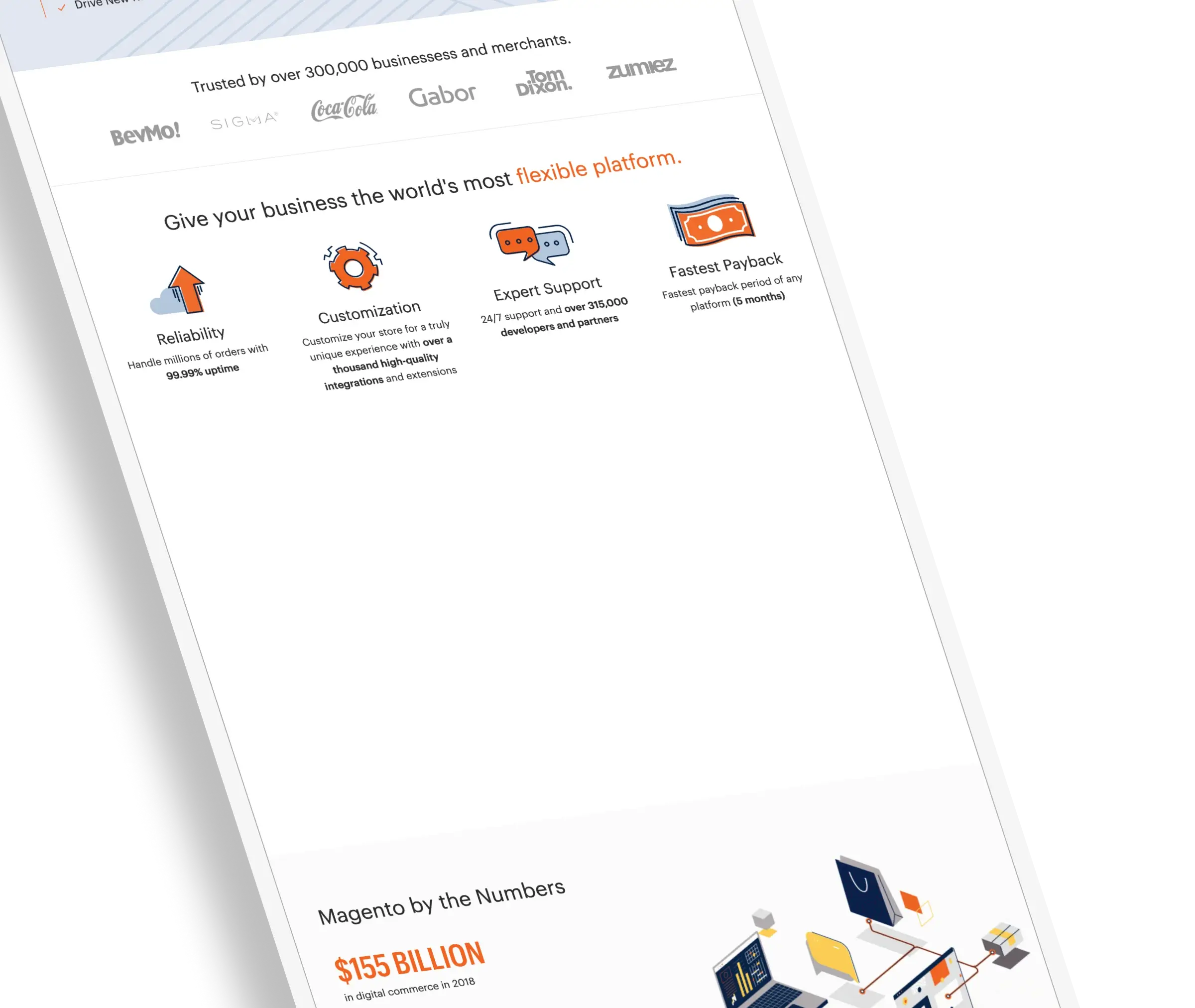
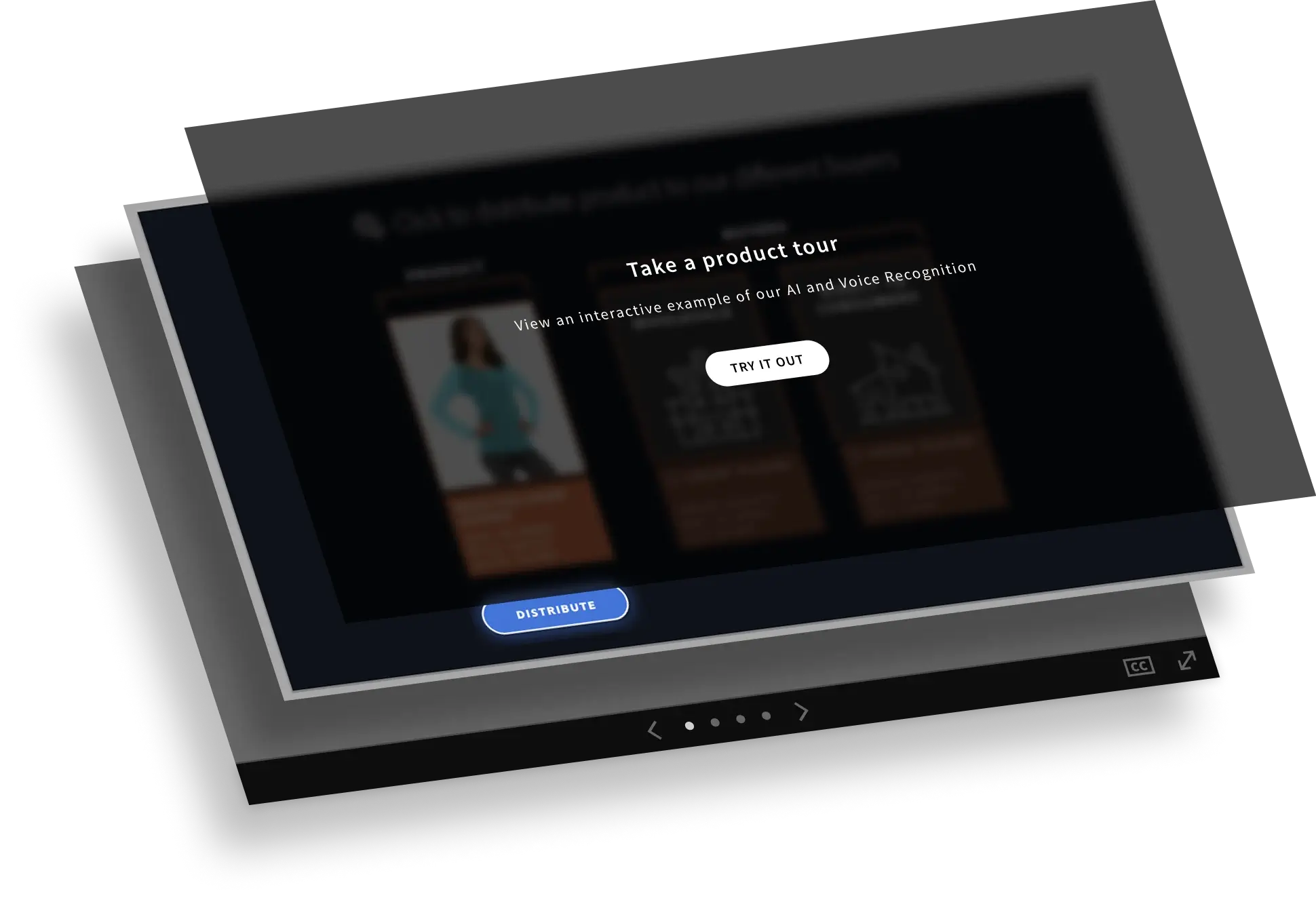
While IdeaCloud’s focus had been on live presentations, the request came from clients’ marketing departments to provide an embeddable version.
We ran a product discovery workshop (Microsprint) to figure out user-centered requirements, conducted user tests, designed and iterated until we all felt confident that the product worked the way users wanted.
The challenge was to make a “non-video” interface, while also making a simulation easy enough for any internet user to navigate. The end result borrowed from recognizable user patters like carousels, while adding visual indicators that you could click in the presentation itself.
Project Results
IdeaCloud tested this new format with their client, Adobe.
3X Performance in 48 hours
[IdeaCloud’s] asset was outperforming every other lead capture asset on Adobe’s Magento website by more than 3X within just 48 hours.
Immediated ROI
Adobe immediately placed an order for half a dozen new stories over the next few months.
James and team at Meticular have leveled up the UX/UI competency and Customer Experience strategy of my product team in spades. He has helped me be a stronger product leader and several teams in our org look to his expertise to better experience across the board.
